


Designing a Composite Structure Diagram is an exercise in clarity. It reveals the internal architecture of a classifier, showing how parts fit together to form a whole. However, the visual arrangement of these components is not merely aesthetic; it dictates how stakeholders interpret system behavior. When components are arranged poorly, the diagram becomes a source of confusion rather than a blueprint for understanding.
This guide explores the specific pitfalls encountered during the arrangement of components within these diagrams. We focus on structural integrity, readability, and semantic accuracy without relying on specific tools. By understanding these common errors, architects can ensure their diagrams communicate intent effectively.
🧩 Understanding the Canvas: Ports, Connectors, and Roles
Before addressing pitfalls, one must understand the fundamental building blocks. A composite structure diagram relies on specific elements to define relationships:
- Parts: The instances of classifiers that make up the composite structure.
- Ports: Interaction points where parts connect to the outside world or other parts.
- Connectors: Links that establish communication between ports.
- Roles: The specific interface a part plays at a port.
Arrangement is not just about placing boxes on a screen. It is about mapping the flow of data and control. Misalignment here leads to ambiguity. The goal is to create a visual representation where the logic is self-evident.
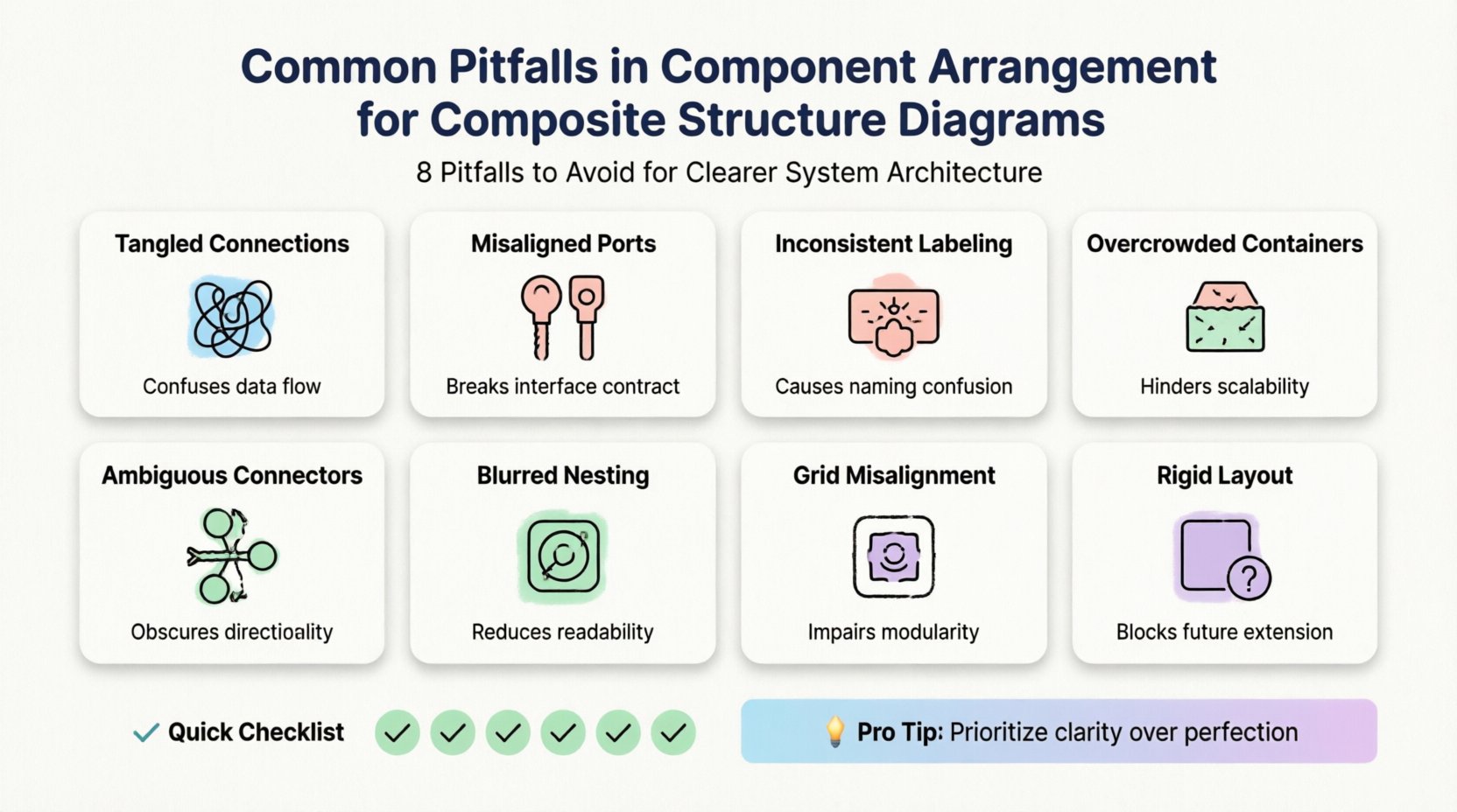
📐 Pitfall 1: Excessive Crossing of Connectors
One of the most immediate visual errors is the chaotic routing of connectors. When lines cross each other randomly, the cognitive load required to trace a connection increases significantly.
The Issue
Connectors should ideally be orthogonal (straight horizontal and vertical lines). When they are drawn diagonally or curve unpredictably, they create a “spaghetti effect.” This is particularly problematic in large composite structures where multiple parts interact.
Why It Happens
- Parts are placed arbitrarily without a grid or alignment guide.
- Connectors are routed manually without respecting orthogonal constraints.
- There is no hierarchy in the layout, leading to long-distance connections.
The Impact
- Reduced Readability: Stakeholders cannot quickly trace a signal path.
- Increased Error Risk: Developers may misinterpret which port connects to which.
- Maintenance Burden: Adding a new part later requires re-routing multiple existing lines.
🔌 Pitfall 2: Improper Port Placement
Ports define the interface of a part. Their placement relative to the part boundary and the overall container dictates how connections are perceived.
The Issue
Ports are sometimes placed deep inside the part box or on the wrong side of the boundary. This obscures the interaction point. If a port is meant to connect to an external system, placing it on the internal edge of a part confuses the boundary of the composite.
Best Practices
- Align with Connections: Place ports on the side of the part where the connection enters or exits.
- Externalize Critical Ports: For parts that interact with the outside world, ensure ports are clearly visible on the perimeter.
- Group Related Ports: If a part has multiple ports for the same interface, cluster them visually to show they belong to a single concern.
🏷️ Pitfall 3: Inconsistent Naming and Labeling
Textual elements are as critical as graphical ones. Inconsistent naming conventions create a disconnect between the model and the code.
The Issue
Different parts of the diagram might use different naming styles. One port might be labeled “in”, while another is labeled “inputPort”. Similarly, roles might be omitted entirely in some areas but labeled in others.
The Impact
- Ambiguity: It is unclear if two differently named ports serve the same function.
- Traceability Loss: Linking the diagram back to the implementation becomes difficult.
- Professionalism: Inconsistency suggests a lack of rigor in the architectural design process.
Resolution
Establish a strict naming convention before drawing. Use camelCase for roles and PascalCase for parts. Always label the role at the end of the connector, not just the connector itself.
📦 Pitfall 4: Overloading the Composite Container
A composite structure diagram is meant to show internal structure. However, trying to fit every detail into a single view often leads to a cluttered canvas.
The Issue
Architects sometimes attempt to show the entire internal hierarchy of a complex system in one diagram. This results in tiny boxes, illegible text, and overlapping elements.
The Impact
- Zoom Fatigue: Users must constantly zoom in and out to find specific details.
- Loss of Focus: The high-level structure is lost amidst the low-level details.
- Printability: The diagram becomes impossible to print on standard paper sizes.
Strategy
Use hierarchy. Create a high-level composite structure diagram that shows major subsystems. Then, create detailed diagrams for each subsystem. Do not force all layers into a single view.
🔗 Pitfall 5: Ignoring Interface Directionality
Interfaces often have a directionality (provided vs. required). Ignoring this in the arrangement can suggest a bidirectional flow where none exists.
The Issue
Connectors are sometimes drawn as simple lines without arrows or lollipop notation to indicate direction. This makes it impossible to know if a part provides a service or requires one.
Resolution
- Use Lollipop Notation: Clearly mark provided interfaces with a solid circle.
- Use Socket Notation: Mark required interfaces with a half-circle or socket shape.
- Arrowheads: Ensure connector arrows point in the direction of data flow or dependency.
🧱 Pitfall 6: Deep Nesting Without Context
Composite structures allow for nesting. However, deep nesting without clear context can obscure the scope of a part.
The Issue
A part might contain another part, which contains another. Without clear visual separation or distinct boundaries, it is hard to tell which part owns which sub-component.
The Impact
- Scope Confusion: It is unclear which interfaces are available at which level.
- Complexity Management: Debugging issues becomes harder when the hierarchy is not visually distinct.
Visual Cues
- Border Styles: Use distinct border styles for different levels of nesting.
- Shading: Use subtle background shading to differentiate nested containers.
- Separation: Ensure there is sufficient whitespace between nested containers to prevent visual merging.
📊 Comparison of Common Errors
The table below summarizes the pitfalls discussed and their primary consequences.
| Pitfall | Visual Symptom | Primary Consequence |
|---|---|---|
| Excessive Crossing | Tangled lines, diagonal routing | High cognitive load, tracing errors |
| Port Placement | Ports hidden inside boxes | Interface ambiguity, boundary confusion |
| Inconsistent Naming | Mixed naming conventions | Traceability loss, maintenance issues |
| Container Overload | Small text, cramped layout | Readability failure, zoom fatigue |
| Directionality | Missing arrows or notation | Behavioral misinterpretation |
| Deep Nesting | Merged boundaries, unclear scope | Scope confusion, debugging difficulty |
🛠️ Pitfall 7: Neglecting Layout Consistency
Consistency is the backbone of technical communication. A diagram that changes its layout logic from one section to another is confusing.
The Issue
Some parts might be arranged horizontally, while others are vertical. Some connectors might be routed above the parts, while others are routed below. This lack of a unified layout strategy creates visual noise.
Best Practices
- Grid Alignment: Align all parts to an invisible grid.
- Uniform Spacing: Maintain consistent padding between parts and containers.
- Standardized Routing: Decide on a rule (e.g., all connectors go above) and stick to it.
🔄 Pitfall 8: Ignoring Evolution and Maintenance
Diagnostics are not static. They evolve as the system changes. Arranging a diagram for the current state without considering future changes leads to technical debt in the documentation.
The Issue
Diagrams are often arranged tightly to fit a page, leaving no room for new components. When a new feature is added, the entire layout must be redone.
Resolution
- Expandable Layouts: Leave whitespace where new components are likely to be added.
- Modular Design: Design parts to be easily swapped without affecting the overall layout.
- Versioning: Keep older versions of the diagram to track changes over time.
✅ Checklist for Arrangement
Before finalizing a Composite Structure Diagram, run through this checklist to ensure quality.
- Are all ports placed on the boundary? Ensure no port is hidden inside a part.
- Are connectors orthogonal? Minimize diagonal lines and crossings.
- Is the naming consistent? Check for mixed naming conventions.
- Is the hierarchy clear? Ensure nested structures are visually distinct.
- Are interfaces labeled? Verify all provided and required interfaces are marked.
- Is there whitespace? Ensure the diagram is not cramped.
- Is the flow logical? Does the diagram read from left to right or top to bottom naturally?
🧭 The Role of Semantics in Arrangement
Arrangement is not just geometry; it is semantics. The position of a part implies its relationship to others. For example, a part placed at the top of a container might imply a control hierarchy, while a part at the bottom might imply a data repository.
Alignment with Domain Logic
- Control Flow: Arrange parts in the order of execution where possible.
- Data Flow: Arrange parts so data flows logically from source to destination.
- Dependency: Place dependent parts near the parts they rely on to minimize connection length.
By respecting these semantic relationships, the diagram becomes a map of the system’s behavior, not just its parts.
🎯 Avoiding the “Perfect Diagram” Trap
There is a tendency to strive for a visually perfect diagram where every line is straight and every box is aligned. While aesthetics matter, they should not come at the cost of clarity.
The Issue
Spending excessive time on pixel-perfect alignment can distract from the actual architectural value. The diagram’s purpose is to communicate, not to be a piece of art.
Balance
- Focus on Logic: Prioritize the correctness of connections over the perfection of lines.
- Accept Minor Imperfections: If a slight curve helps avoid a crossing, allow it.
- Iterate: It is better to have a slightly messy diagram that is updated than a perfect one that is never changed.
📝 Summary of Arrangement Principles
Effective arrangement in Composite Structure Diagrams requires a balance between visual clarity and semantic accuracy. By avoiding common pitfalls like excessive crossings, inconsistent naming, and poor port placement, architects can create diagrams that serve as reliable references for development and maintenance.
Remember that the diagram is a living document. It should evolve with the system. Prioritize readability and consistency over rigid adherence to aesthetic rules. When the arrangement supports the understanding of the system, the diagram has fulfilled its purpose.
🚀 Moving Forward
As you refine your modeling practices, keep these guidelines in mind. Regularly review your diagrams for the pitfalls discussed. Encourage peer reviews to catch arrangement errors early. By committing to high-quality structural representation, you contribute to a more maintainable and understandable software architecture.
The effort spent on proper arrangement pays dividends in reduced miscommunication and faster onboarding for new team members. A well-arranged diagram is a silent partner in the success of the project.